dore74 wrote: ↑Tue Mar 22, 2022 12:25 pm
old guy here. seriously. why, the old stuff was wonderful.
Would really like to know what younger folks on the board (I'm class of '74, do the math) think of this. It's your all's University increasingly.
Guess we old farts are in the same boat. What was wrong with the old logos ? And that new "V" is ugly. Especially as it pertains to athletics, we have gone through more variations with no evidence that I can see of logo change leading to improved success. Just looks like a lot of expense in new signage, letterheads and other printing perhaps only to cater to some egos on campus. If we suddenly win several national titles (other than in baseball ) or vault past Harvard and Stanford academically due to our spiffy new logos , I will eat a huge plate of crow.
I like the wider V. I don't know why we couldn't have used it with the Star for a slightly modified star V. There is a star in the university seal. The wide V is fine to me, but it seems like we changed for change sake. The university seal is a little busy to me with all that sunburst going through it. No doubt all of this has been market tested ...
Seems like our new "V" is more like a hybrid between Villanova's V and our old logo in terms of font. I don't hate it, and would assume that it appeals to the younger generation? Or that there wasn't anything historic about our old logo that it could change? I guess I would prefer as classic a style as we could get, but I'm probably no longer the target audience.
EagleDore wrote: ↑Tue Mar 22, 2022 1:47 pm
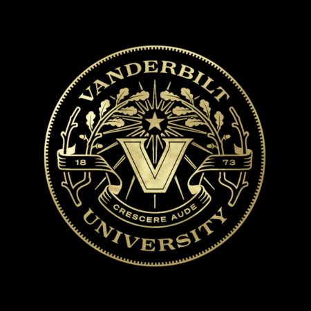
Crescere Aude - Dare to grow.
I like the wider V. I don't know why we couldn't have used it with the Star for a slightly modified star V. There is a star in the university seal. The wide V is fine to me, but it seems like we changed for change sake. The university seal is a little busy to me with all that sunburst going through it. No doubt all of this has been market tested ...
It amazes me how some of these marketing experts seem to think they understand what is fashionable or cool. What was wrong with the classic star v logo? Nothing. The only thing new we need is a new stadium and someone who knows how to recruit some of the 4 and 5 star talent out there. Who cares about a rebranding? A new Logo isn't going to get us to a bowl game or beat that over hyped team to the east. This logo is lame...
As someone said earlier, I don't dislike the new V. I also know that our athletic teams have used varying logos over the years. I also understand the desire to go with one logo.
But there's also nothing wrong with the institution and athletic teams having different logos, which is the case at a lot of places. And if there has been one logo MOST identified and associated with the Commodores -- particularly the football team -- it's been the Star V. I like the Star V. As someone said above, it's clean, crisps and easy -- and has traditionally been used ONLY by Vanderbilt. I hate to see it go.
But I'm not going to buy new branded apparel until what I have wears out. 8-)
Classes of ’04 and ’08. I immediately texted my two best friends from VU about this change and was critical of it. We all agree it is garbage. My take:
It reminds me of the NHL Vegas Golden Knights lettering. Stupid. Flash in the pan garbage instead of acknowledging the legacy and history of the University.
Why is VU marketing so bad?!?
Edit: My friend’s take: “Time to buy up remaining gear.”
To be honest, I can't stand the "Star V" logo that we've had for years. I thought it was ugly when they introduced it. It didn't grow on me. The Star shape has no connection to the university and it largely took the gold out of the log. I'm in the "anything is better than the Star V" camp.
As far as the specific logo? I like the slightly wavy shape. I like having the gold back. My favorite athletic Vandy logos have always been the ones actually incorporating the Commodore into the logo (like the ones where he appears in the center of the V, like he's charging out of it). So, this new one isn't my favorite ... but I can live with it.
On a related note, I also like the new seal. My favorite university logo has always been (and always will be) the V with the oak leaf silhouette in the negative space ... but I guess that doesn't make sense for an athletic logo.
mathguy wrote: ↑Tue Mar 22, 2022 3:28 pm
I'm a fan.
To be honest, I can't stand the "Star V" logo that we've had for years. I thought it was ugly when they introduced it. It didn't grow on me. The Star shape has no connection to the university and it largely took the gold out of the log. I'm in the "anything is better than the Star V" camp.
As far as the specific logo? I like the slightly wavy shape. I like having the gold back. My favorite athletic Vandy logos have always been the ones actually incorporating the Commodore into the logo (like the ones where he appears in the center of the V, like he's charging out of it). So, this new one isn't my favorite ... but I can live with it.
On a related note, I also like the new seal. My favorite university logo has always been (and always will be) the V with the oak leaf silhouette in the negative space ... but I guess that doesn't make sense for an athletic logo.
I wish we had kept the oak leaf V on the academic side. Not thrilled with the new V for athletics, but it's just not what I'm used to.
This seems like focusing on new paint for the living room when the roof has leaks. VU has more pressing things to address than logos.
If VU sees a need to improve the image of the university (which in itself I don't understand as VU's image nationally is very sound) and develop what they feel is a better marketing approach, the first step might be to fire the entire marketing group and start over from that point. Is this a new marketing group ? The first step in improving a football program, for example, would be to recruit greater talent as coaches and players, right ? I hope no one believes that the first step toward improving a program would be to buy new uniforms.
I honestly hate to be so harsh, but we have been dealing with so many marketing shortfalls over the years that it is hard to accept just one more.
Well the single star is significant for it's history as a component of the original Commodore insignia as part of naval rank. Is there another reason why the Star has been removed?
Are we looking at more cancelling of a small part of US culture?
Wouldn't be a surprise these days.
The Star V has been a real important part of the VU teams identity for years. Lets hope it survives. Same with the script basketball uniforms.